ArtCrawl - Mobile App Design
Step 1 - Empathize & Define
Design an app that is useful for people who want to visit multiple art exhibits in a single day.
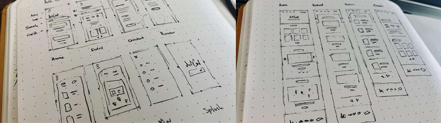
Step 2 - Ideate With Rapid Sketching
Rapid sketching was used to quickly explore multiple layout ideas.
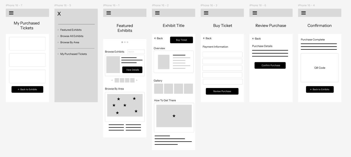
Step 3 - Low-Fidelity Prototype
A low-fidelity prototype was used to conduct a usability study and gather user feedback.
 View Lo-Fi Prototype
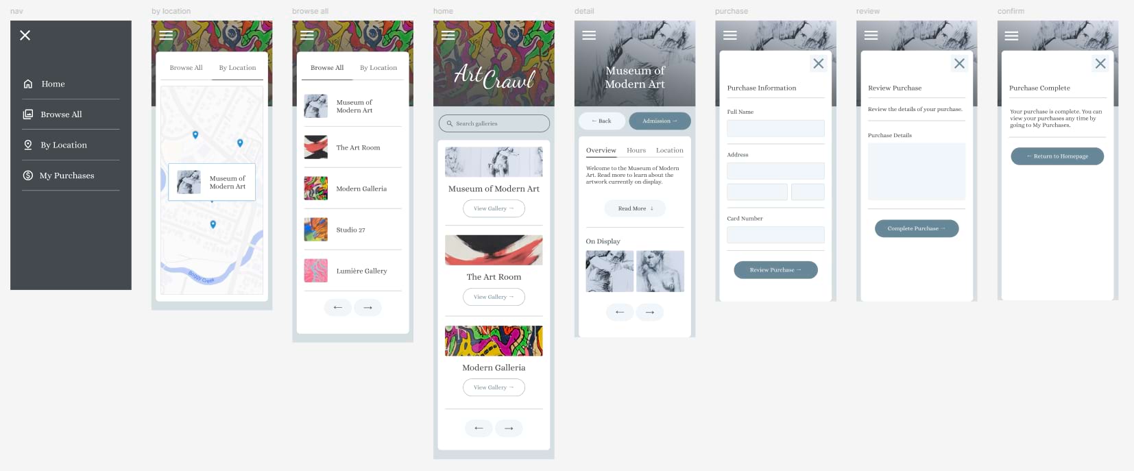
Step 4 - High-Fidelity Prototype
A high-fidelity prototype was created allowing for further testing and feedback focusing on visual elements.
 View Hi-Fi Prototype
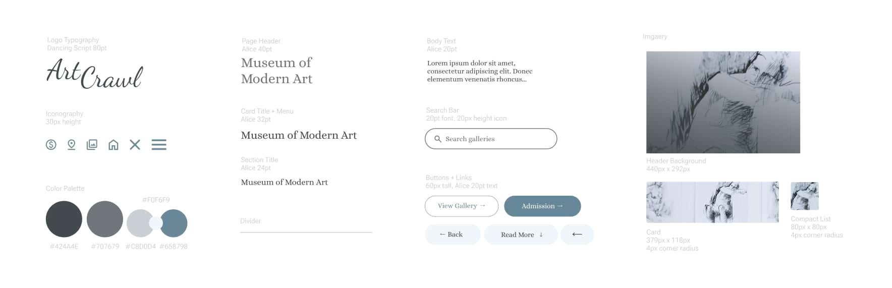
Step 5 - Style Guide
A simple style guide was created to ensure consistency of visual elements.
Step 6 - Iterate & Refine
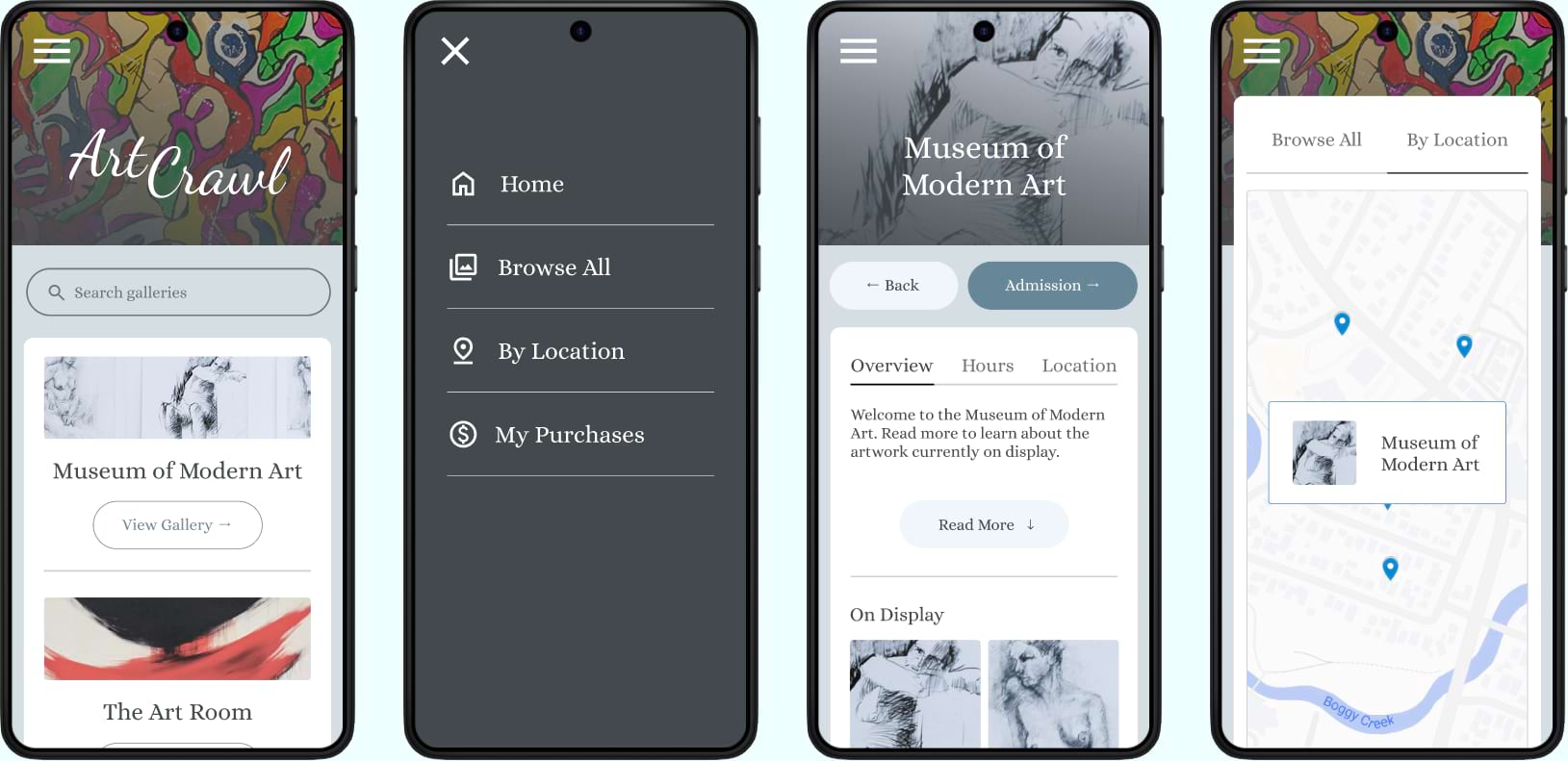
Screenshots of the finished mobile app design after incorporating feedback from user testing.
ArtCrawl - Responsive Website Design
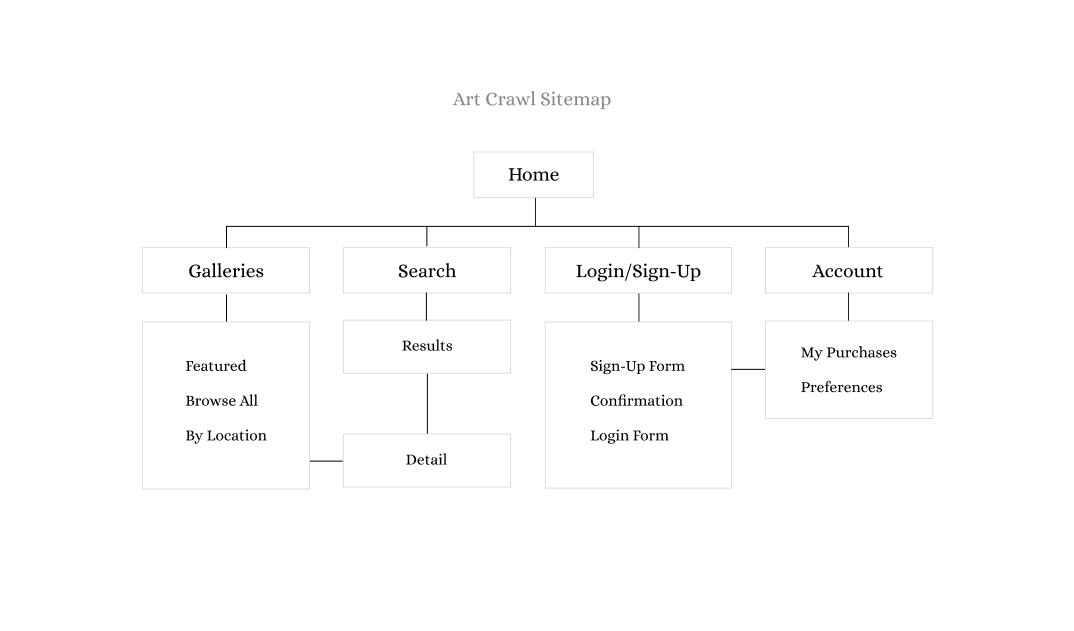
Step 1 - Sitemap
A simple sitemap was created to establish the information architecture of the website.
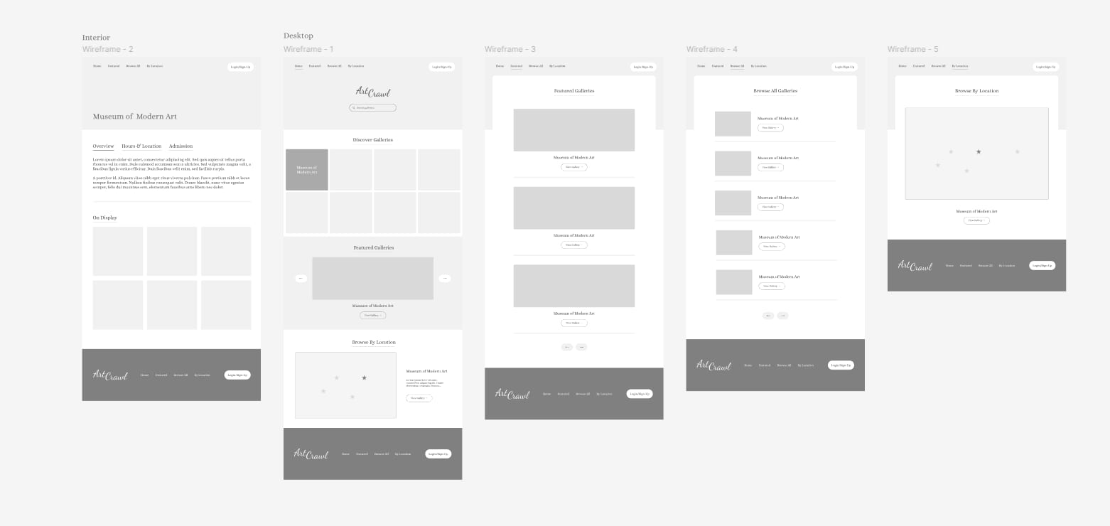
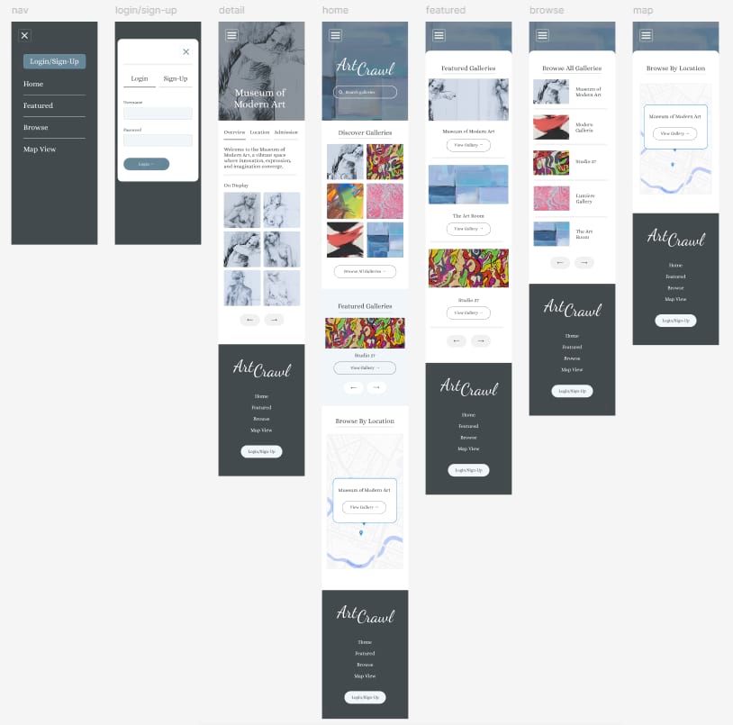
Step 2 - Low-Fidelity Wireframes
Low-fidelity wireframes were created to establish page layouts.
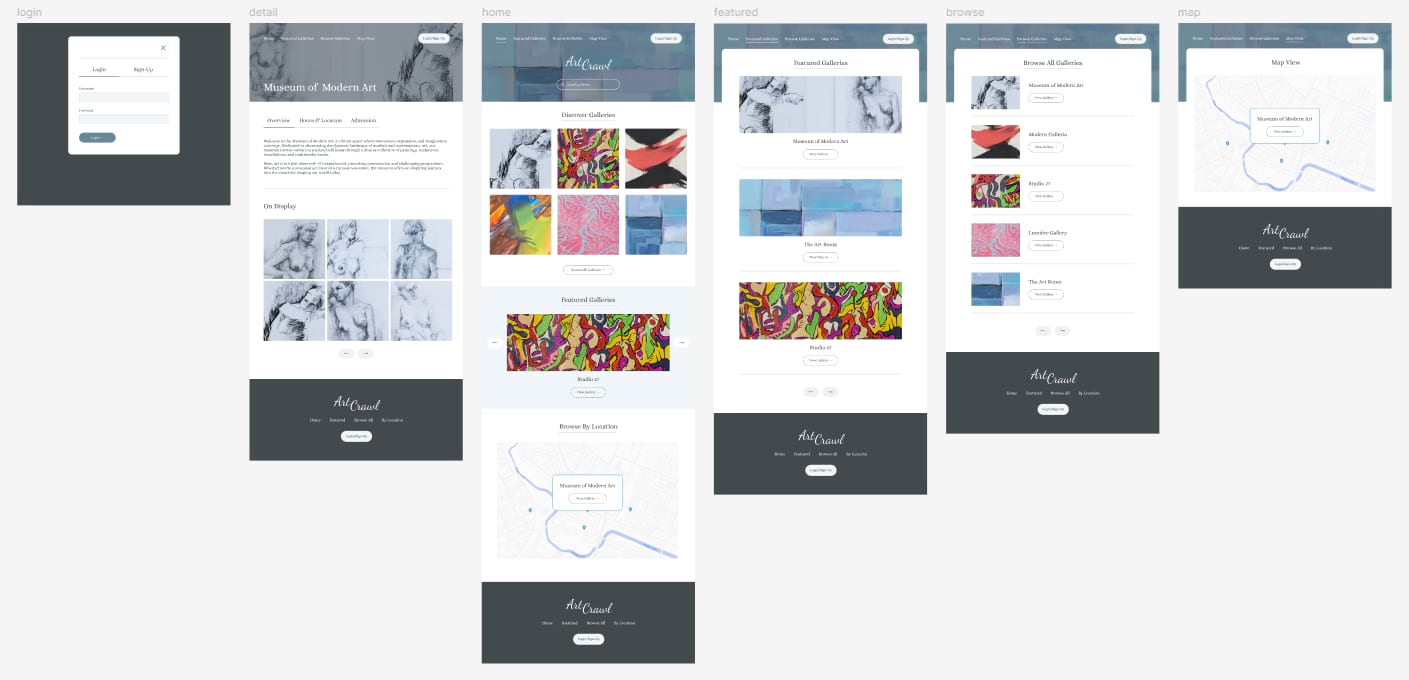
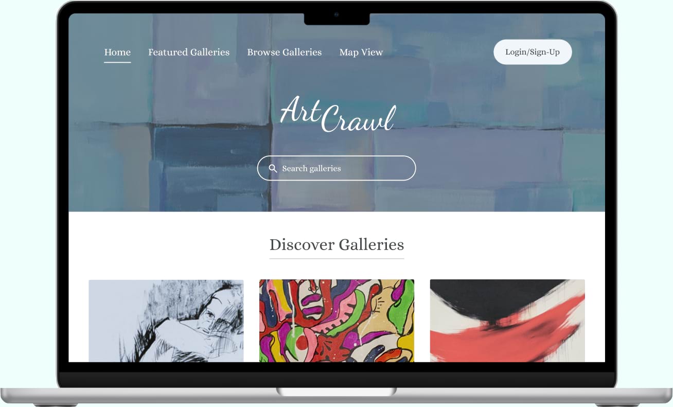
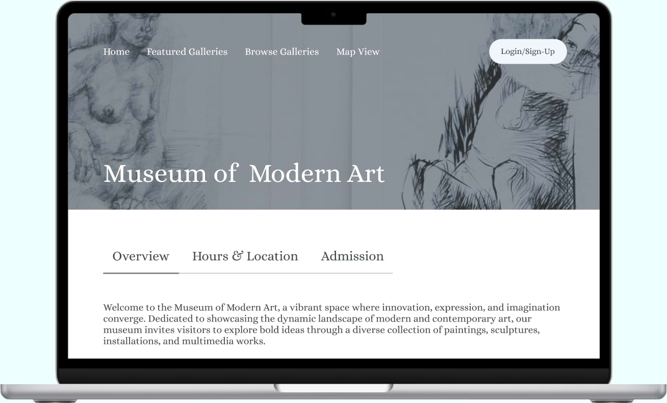
Step 3 - High-Fidelity Mockups & Prototype
High-fidelity mockups and a prototype were created after several revisions to the lo-fi design.
 View Desktop Prototype
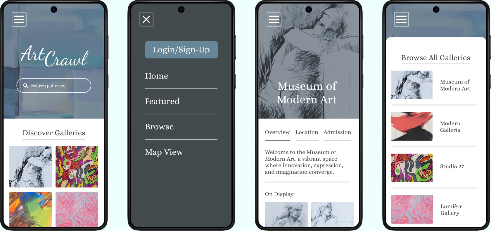
Step 4 - Responsive Design
Each page of the desktop design was modified to fit on a mobile screen.
Step 5 - Iterate & Refine
Screenshots of the finished website design after incorporating feedback from user testing.
Back to Case Studies